A Practical SEO Guide to Technical SEO
Technical SEO is the foundation on which successful SEO campaigns are built. If you're not a web designer or developer then this guide to technical SEO is for you. You can learn the key technical issues that expert SEOs look to resolve to prevent issues for users and search engines.
Chapter 1 - Beginner’s Guide to Tech SEO
Welcome to our “Ultimate SEO Guides”. We want to provide readers with actionable insights with regards to different elements of SEO. We understand that our market moves quickly and therefore we have invited search professionals to help contribute to our SEO guides.
In the fifth instalement of our series, we are looking at the Ultimate Guide to Technical SEO and we have four authors who have helped produce this actionable and step by step guide:
- Georgie Kemp
- Jess James
- Hamlet Batista
- Koray Tuğberk Gübür
Technical SEO is part of the “brilliant basics” of any SEO strategy. You may need to adapt how to implement the recommendations depending on the team and the website platform but it is one of the first elements of SEO that should be planned and incorporated when starting any project. Learning technical SEO can take time and is something that cannot done overnight. There are plenty of resources such as Blue Array’s SEO course and of course Moz. At Tea Time SEO, we tackled just a couple of crucial elements and our authors have shared their experience in the guide.
What is technical SEO?
Technical SEO refers to the process of optimising your website for the crawling and indexing phase. The goals between technical SEO and other SEO channels are pretty much shared whether the technical SEO strategies are there to create solid foundations between both on page and off page strategies to work efficiently.
Before diving into technical SEO practices and how to complete audits, we go through the fundamentals, these being the understanding of how websites work, how search engines understand websites, and then how users interact with websites.
How websites work
Computers are connected up to the web and called clients and servers. Clients can be defined as a user’s typical internet-connected device, such as computer, smartphone, tablet etc. Servers on the other hand store web pages, websites and apps. When a user types an address or a search query into a browser, a copy of the webpage downloaded previously is served on the client side to the user.

How search engines work
Search engines work by crawling billions of pages throughout the web using hyperlinks. So to do this, search engines will use their own crawlers as also known as search engine bots or spiders. Once a new page has then been discovered, it can then be rendered and indexed. Various authority and relevance metrics are then scored to ensure that the most relevant results are then retrieved against the search query in the search engine.
However, as there’s been a huge rise in JavaScript powered websites, Google realised it had to start rendering web pages more like modern browsers. So back in 2018, it introduced the second wave indexing. If a page has JavaScript in it, the rendering is actually deferred until Google has the resources ready to then render the client side content and then it will index the content further a bit later.
How users interact with websites
Search engines have some of the most intelligent data mining operations and algorithms than any other piece of technology. They continually collect data to understand an individuals behaviour and help their displayed output become more user-centric. It’s crucial to understand the intent behind queries by dissecting the language used, enticing users to click on your web page, breadcrumbs and a clear navigation, fast site speed and creating a seamless user experience.
1. Manual checks are good
Be a lot more human during your auditing process. It’s always encouraged to manually audit your site, so just in the way that a Google bot and users would interact with your site and navigate it, try to get familiar with the site as a whole. Look at the overall site architecture, high value, low value pages, how’s the internal linking working, and get a feel of it there. Then try and identify different technologies that the website’s built on, for example use the Chrome extension Waffleizer to quickly have a look at what our website is built on. Then analyse what tools will be best to use to crawl the site.
Continue to troubleshoot the site from accessibility, crawlability, indexability, all these different areas of the site, and then always make it bespoke to every single audit.
It’s also really important to understand who you are actually delivering your audit to. This will help to really structure your recommendations. If it’s being delivered straight to a developer, these recommendations should be incredibly concise and actionable. However, if it’s being delivered to other stakeholders, who may not come from a technical background and might not have a real understanding of SEO, then include the reason for the recommendations. For example, the return on investment, or talking around the KPIs that the recommendation is looking to tackle.
2. Technical SEO - always more to learn
Don’t worry about what others are doing. Try and not be fazed by those around you that may have more experience or have been in the industry a lot longer than you. Technical SEO as a whole is pretty much a learning curve and comes with all the analysis that you complete. Technical SEO is self taught, you do not learn it at university. No matter if you’re working in an agency, in-house, freelance, try and audit as many sites as possible, whether that be utilising a crawling tool, manually auditing, or a combination of both. This will then give you exposure to a range of issues, range of websites, that you can then look out for in the future, and then also lean on others around you.
3. Discipline
Technical SEO is a discipline, it’s something that can’t be taught overnight. It’s ever-evolving, and knowledge comes with time, so keep at it, keep updated with all the different industry news. Twitter is great for that. Take the time to really empower those around you, as diverse thinking really does breed creativity in all senses of life, as well as technical SEO issues. Reach out and explore the incredible communities out there, such as Women in Tech SEO. Good people will always want to help answer your questions and you in turn can help provide the answers to theirs. Technical SEO is never finished and there is always something new to learn.
Chapter 2 - How Best to Get Tech SEO Implemented
Unlike many other SEO changes, it can be tricky to get technical SEO improvements implemented; more often than not they require input from developers, who are often quite a stretched resource who have to triage requests from all aspects of the business. So, we need to plan our approach to implementations to make sure they get to the front of the queue.
At our agency ‘Erudite’ we tend to be successful when we take a two-pronged approach to communicating the technical SEO recommendations:
- Prong 1 – Demonstrate the value of your recommendations
- Prong 2 – Make your request clear and easy to understand
Demonstrating the Value of Your Recommendations
The first ‘prong’ of the Erudite approach will aim to communicate the value of the request in terms of the site performance improvement it will have. When deciding how to prioritise development tasks, it’s much easier to bump a task up the list if it’s clear it’s going to have a tangible performance benefit.
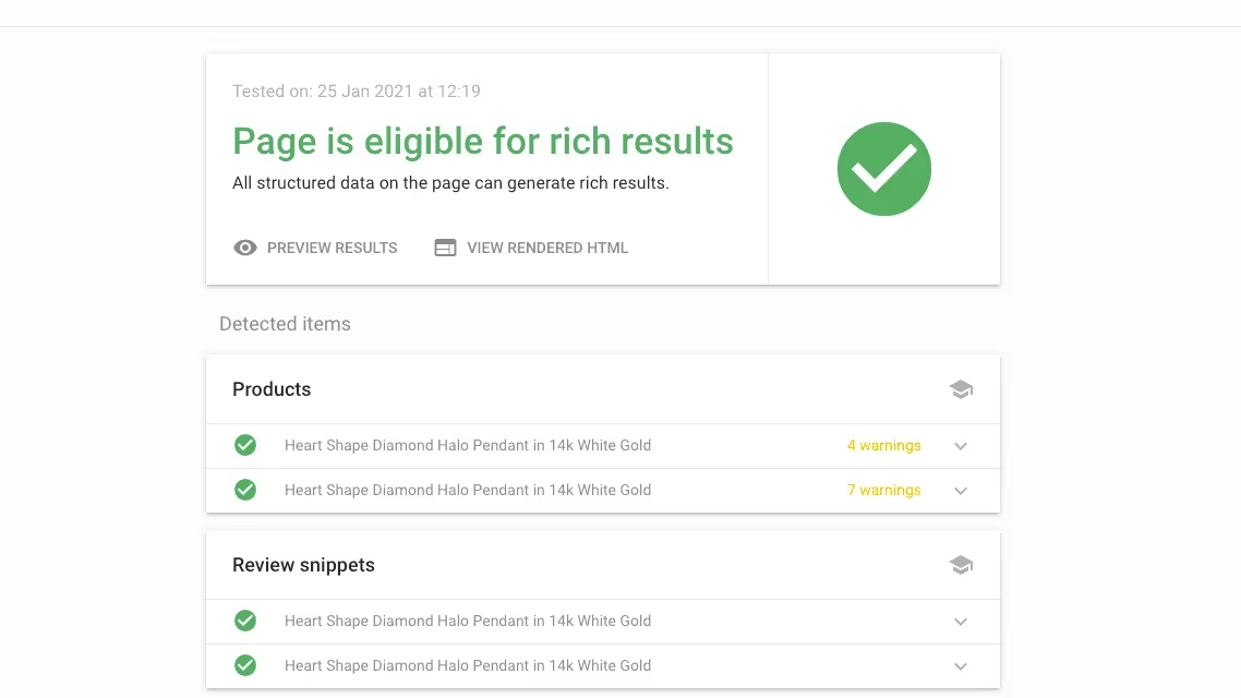
For example, suppose you’d like to implement structured data on your product detail pages to target featured snippets like this:


It may be tempting to provide a code sample to be implemented on all product detail pages or send a link to Google’s product structured data implementation guide. While this may technically be enough for your developer to get the job done (although sending them a link might be a bit of a pain – your developer probably doesn’t want to have to become a structured data expert before they can start), it doesn’t do a good job of demonstrating why you’re making the recommendation or why it should be a priority. So how could you communicate this request in a way that really sells its value?
1. Present your recommendation in a hypothesis framework
Presenting your idea in a hypothesis framework makes it much easier to ground your recommendation in the context of how it will improve the site, and the tangible effect it may have. A hypothesis framework for a product structured data request could look like:
- We know that product structured data makes our product pages eligible for rich results.
- We believe that winning these rich results could increase our click through rates by X%.
- And will result in an Organic traffic increase of Y%.
- Which translates into a revenue increase of Z%, based on our current conversion rate and AOV.
This framework explicitly shows what you hope to implement, why you want to, and a tangible measurement of the benefit to the business.
2. Run small scale tests to prove its value
However, it’s not always easy to estimate what the performance increase of an implementation like this could be until it’s actually complete. Luckily for many technical SEO tasks (canonicals, structured data, hreflang etc.) it’s straightforward to run small scale tests using Google Tag Manager. Test the recommendation on a handful of URLs, monitor the performance of these URLs against the rest of the site and use this as the basis of your estimation.
3. Present support from Search Engine documentation
Sometimes it’s not possible to estimate the potential impact of the recommendations; maybe you can’t use GTM to test, or you may be preparing for a Google Core Update (for example, it’s a good idea to start addressing Core Web Vitals now, ahead of them coming into play next year, but there is no way of telling how much they’ll impact rankings until then).
In this case, it can be useful to present support from Google’s (or another Search Engine’s) documentation, or a piece of third-party research that shows the task’s importance.
Making Requests Clear and Easy to Understand
Now you’ve presented the recommendations in a way that should help it become a priority, the next step is to ensure you’re making the work as appealing and straightforward as possible, so that developers can easily pick it up and complete it without having to do huge amounts of background research, without the risk that’ll you’ll need to make amendments or revisions once it’s complete.
1. Explain the problem & work to find a solution
Going back to the product structured data for our Halloween Crocs. Rather than sending a code example and asking our developer to implement it on every page of the site, there are a few things we might want to consider.
For example, are there any products that you don’t want this implemented for? Many sites include product widgets on content and product detail pages (under a ‘Related Products’ block or similar). It’s likely you only want to implement structured data for the main product on a page, so you need to make sure you’ve identified these caveats and pointed them out.
Or perhaps the developer is particularly busy at the moment, and won’t have time to dynamically create structured data on each page for some time. If you only presented your solution (to have this dynamically created for each page), you might have to wait a long time before it would be implemented. However, if you explain what you are trying to achieve and work with the developer to find a solution, it may turn out that they could create a free form meta field in the CMS that allows you to paste in your own JSON-LD in much less time.
2. Provide code or site examples
If your recommendation lends itself, it can be helpful to provide code samples for your developer to work from. Canonicals, structured data and hreflang tags are all great examples of implementations where you could provide your developer a code template as a starting point.
Other tasks may be trickier to put together a code sample for, so try to point out some other sites or pages that are good examples of what you’re aiming for.
3. Make sure your recommendations are realistic
Finally, make sure your recommendations are realistic. Take some time to understand how complex your request is going to be to implement, and work with your developer to see if you can come up with a sensible compromise or middle ground. You may have the ‘perfect solution’ in mind, but often sites don’t need highly complex ‘perfect solutions’ to see results (‘good enough’ is often good enough!). Consider whether the time and complexity of your task will be outweighed by the benefits or whether there are more straightforward recommendations you could focus on.
Chapter 3 - Google Shopping
While the Tech SEO recommendations are being implemented you can continue to maximise the assets you already have. One of these is Google Shopping which is a must for any eCommerce site. Hamlet Batista shares his recommendations with us on Tea Time SEO.
Take advantage of Google Shopping’s free retail listings
In June 2020, Google began listing products alongside Google Shopping results for free. This means that your products can be listed in the Shopping tab of Google results at zero cost per click. Your products will also be eligible for product knowledge panels like this:

However, there is some up-front setup needed for Google Shopping to list your products.
Here is how you can get started:
- Complete the free registration process at Google Merchant Center.
- When you set up your account, opt in to allow Google to show your products in free listings. See the instructions under “Ensure that your feed is opted in to free listings”
- If you have retail stores, opt in to show your products on local surfaces across Google.
- Create a product feed to give Google all the relevant information about your products and submit it to Google Merchant Center.
- Monitor the product feed for any issues. In Google Merchant Center, go to Products > Diagnostics and review any errors that appear.
- You may see errors such as “Violation of shopping ads policy” that do not look accurate, i.e. a harmless product being labeled as dangerous.
- Review the product to ensure that it does not violate Google’s policies, and then submit the product to be reviewed.
- Google limits how many products you can submit for review per week, so it’s recommended to go through these on a weekly basis when you first set up the feed.
Optimize product images for SEO
Product images are critical for online conversions, but they can also drive traffic to your site. Google displays image search results alongside the regular organic results. Some sites find that up to 10% of their traffic comes from image searches.
Here are some tips to optimize your images for search:
- Avoid excessive text in images. Use CSS to overlay the text instead.
- Use descriptive image file names, such as the name of the product instead of image14.png
- Use alt text to describe what the image contains. Alt text improves accessibility for users with visual impairments, but Google also uses alt text to understand images.
- Don’t stuff unnecessary keywords into your alt text. It should read naturally.
- Search engines also use the content around images to understand it, so your images should make sense in context.
- Consider using an image sitemap.
Also check Google’s detailed guide to best practices for images.
Use schema.org markup for shipping data
If you are not already using schema.org markup on your pages, you should be! This is a topic that is well-covered elsewhere, so this guide will just highlight a new type of schema for shipping data.
The shippingDetails schema will make it possible for Google to display information about your shipping in the search results. This is an opportunity to highlight free shipping to users. Here is an example from the recent Google Webmasters announcement:

Here are some best practices for implementing this type of schema:
- Only use the shippingDetails schema on pages that contain one product. This could be a product page on an ecommerce site, or a shopping aggregator page that lists multiple retailers for a single product.
- Set the shippingRate property to zero for regions that you offer free shipping to. This property can be specified for defined regions.
- Use the doesNotShip property to indicate regions that you don’t ship to.
- If you have multiple shipping options (for example, 2-day delivery and standard shipping), you can use multiple shippingDetails properties that contain the details for each type of shipping, using the deliveryTime property along with the shippingRate property.
Google’s guide to product schema contains example code. See more details on schema.org.
Optimize for local store rankings
If you have physical stores, local search results can be a way to drive sales at your retail locations. Customers search for not only the name of stores that they plan to shop at, but also for types of stores and products that they need. Hopefully, you rank well for your brand name, but what about for “kitchenware near me,” “appliances near me,” or “furniture near me”?
Follow these tips to optimize for local search results:
- Create a webpage for every store location using the URL structure /country/city/store. Ensure that search engine bots can crawl every store by following links from your homepage.
- Add content to the store pages to make each one unique. List information such as the hours of operation, phone numbers, a map of the location, and reviews from customers.
- Add structured data for local businesses to the page so that search engines can gather the relevant information for the Knowledge Graph.
- Verify all of your locations in Google My Business, using the bulk uploader if you have many locations.
- Use Search Console to discover how users are searching for your business. Incorporate relevant keywords into your title tags.
Visit Practical eCommerce to learn how to create a Google Product feed from XML and Search Engine Journal goes into detail about generating text from images with python here.
Chapter 4 - Core Web Vitals and Page Experience Optimization
Core Web Vitals is not just about page speed!
It is a combination of page speed optimization, safe-browsing, adoption of proper monetization policies and ad placements within the context of the Page Experience algorithm and score.
Core Web Vitals has different thresholds to pass in each of these areas in order to get a passing grade from the Page Experience Algorithm.
A page optimized for Core Web Vitals can be effectively ‘labelled’ as providing a “Good Experience” within the scope of Google’s Page Experience algorithm and help it to get a better ranking for competitive queries.
In this article, definitions of Core Web Vitals elements, optimization methods, and instructions for preparing a website for the Page Experience algorithm will be explained.

What are the Core Web Vitals Elements?
Core Web Vitals elements that need to be optimized within the scope of the Page Experience Algorithm of Google are listed below.
- Largest Contentful Paint (Perceived Page Speed)
- First Input Delay (Loading Responsiveness)
- Cumulative Layout Shift (Visual Stability)
- HTTPS (Safe Browsing)
- Responsive Design (Mobile-friendliness)
- Interstitials (User Experience)
How to Optimize Core Web Vitals?
To optimize Core Web Vitals, Pagespeed, User Experience, and Web Security should also be optimized. In this section, advice for optimizing for Core Web Vitals also includes these three different aspects (Pagespeed, Safe Browsing, and User Experience) and their related sub-sections.
Optimize Largest Contentful Paint (Perceived Page Speed)
A Core Web Vitals metric that measures the occurrence of the largest content elements in the viewport is the Largest Contentful Paint (LCP). This can be used to determine when all the content of the page has been rendered. Slow server response times are the most common cause of poor LCP.

Which Other Pagespeed Metrics are Related to the Largest Contentful Paint?
To optimize Largest Contentful Paint (LCP), the related page speed metrics should be optimized too, such as First Paint, First Meaningful-Significant Paint, or Time to First Byte.
A page speed metric might not be included in the Core Web Vitals directly, but in an indirect way, they can affect the direct Core Web Vitals signals such as User Experience. Every page speed metric is connected to another one in terms of page loading performance, thus the Largest Contentful Paint optimization in the scope of Core Web Vitals should be evaluated with related page speed metrics and not in isolation
What is the Weight of the Largest Contentful Paint for the Lighthouse Pagespeed Audits?
The largest Contentful Paint has 25% weight for the end score of the Lighthouse Pagespeed Test in the v7.
Why is Largest Contentful Paint Included into the Core Web Vitals?
- The Largest Contentful Paint is included in the Core Web Vitals because it is a central page speed metric, in other words, a page with a good LCP Score should also have a good First Contentful Paint, Speed Index, and Time to First Byte score.
- The largest Contentful Paint has a 25% weight on the Lighthouse Pagespeed Test Results.
- The largest Contentful Paint can be measured with the lab tests.
Why is Total Blocking Time not Included in the Core Web Vitals?
The second most important Lighthouse page speed metric is the Total Blocking Time with another 25% weight, but Total Blocking Time (TBT) is not included in the Core Web Vitals since it can’t be measured in page speed tests in a proper way. Total Blocking Time can be understood correctly via Real User Metrics (RUM), not with the lab data. Thus, unlike Largest Contentful Paint, it is not included in the Core Web Vitals. In this context, Largest Contentful Paint is included in the Page Experience Algorithm within the scope of Core Web Vitals (CWV), not just because it is effective, but also because it can be measured without the need of RUM. For a Search Engine, it is easier to measure, but also it has a contextual functionality for evaluating the web page.

How Largest Contentful Paint has a Context Signal for a Web Page?
Largest Contentful Paint is important for the initial contact section of a web page, and above the fold section of a document. The largest visible element of the initial contact section of a webpage also identifies the web page’s purpose, characteristics, and relevance for certain queries, or industries. So, in other words, LCP is a metric for page speed, but Largest Content (LC) is also a contextual signal for the search engines.

Also, the initial contact section of the web page communicates with the users to define the purpose of the web page. To understand the importance of web page layout and its meanings, signals for search engines you can read the related documentation. And, a slow LCP might dilute the context of the web page layout or the initial contact section for users’ perception, and indirectly search engines.
How is the LCP Element of the Web Page Determined?
To determine the LCP Element of the web page, the browser tries to choose the biggest “HTML div” element. But, also visual completeness and being visible are the most vital factors to determine the Largest Contentful Paint element. Knowing how the LCP Element has been chosen is helpful for optimizing LCP and understanding the browser’s working principles.
- If an HTML Div element is selected as the LCP Element for a long time while the web page is loading, the browser may not be able to select a larger HTML Div Element that is loaded later as the LCP Element.
- An HTML Div Element that contains the three major HTML Div Elements cannot be an LCP Element versus a single element as big as one of each of the three parts.
- LCP Elements with an Image can be changed based on the image resizing during the web page loading. If the image is smaller than the other candidates, the LCP HTML Element can change too.
- If the Image Elements are resized, the smallest size will be considered for LCP Determination.
Which Elements can be chosen as an LCP Element?
LCP Elements can be chosen among the HTML Element types below.
- Image Elements
- Text Elements
- Video Poster Images
- HTML Elements with CSS Background Images
In the future, video and SVG elements will be accounted for in the LCP determination.
How to Optimize Largest Contentful Paint?
To optimize the Largest Contentful Paint, the methods below can be used.
- Use Critical CSS.
- Shorten the Critical Rendering Path.
- Use better technologies for server-side compressions, such as Brotli.
- Optimize your TCP Slow Start.
- Use Asynchronous CSS.
- Defer all of the non-content JS.
- Decrease the Layer Count to be rendered.
- Decrease the DOM Size.
- Use Shadow DOM.
- Use Service Worker.
- Optimize the HTTP Cache Strategy by using Browser-side Caching.
- Use Varnish-like layers.
- Clean all the unused CSS and JS codes.
- Reduce the Request Count by creating bundles.
- Use font-variables.
- Delay the rendering of the below the fold.
- Use HTTP 2.1 or HTTP QUIC for better RTT.
- Compress all of the images by cleaning unnecessary pixels.
- Compress and Minify the HTML, CSS, JS.
- Use AVIF, WebP, or JPEG XL for images.
- Compress videos, and do not use GIF.
- Use Adaptive Serving for the slow connections.
- Use browser hints such as preload, or preconnect.
- Decrease the DNS Resolution need by decreasing the size of the resource map.
What are the main causes of the slow LCP?
The main reasons for the slow LCP are listed below.
- Slow server connection.
- An excessive DOM Size.
- Unnecessarily big and prioritized non-content-related third-party scripts.
- Bad resource load order.
When the LCP is announced by Google?
The largest Contentful Paint (LCP) has been announced at the end of 2018 within the Github Lighthouse repository. But, it was not an official announcement. It has been used during the development process of these new concepts of page speed.
The next sentences will include opinions about the process of the LCP announcement.
In 2019, Bartosz Goralewicz published a video and announced that LCP will change page speed optimization in the future. I was one of the first people who watched this video. And, I must thank him for publishing this awesome and brief video. During the coming weeks, I have researched the Lighthouse repository of Google on Github to learn more, and I have written an article called Advanced Page Speed Metrics, because “Core Web Vitals” was not a concept or term at this time. I think this was one of the first articles about Largest Contentful Paint and other new and modern page speed metrics.

What are the LCP Thresholds for Core Web Vitals?
LCP Thresholds are listed below.
- Below 2.5 seconds is fast.
- Between 2.5 seconds and 4 seconds is average.
- Above 4 seconds is bad.
To have a passing score for the LCP, 75% of the users should experience a faster LCP than 2.5 seconds in the Chrome User Experience report.
What Can You Do If You Can’t Beat the LCP Threshold for Core Web Vitals?
Despite every page speed optimization methodology, if the LCP couldn’t be optimized, changing the LCP content can help. From an image to a text, or to another image the LCP scores can be optimized. And, sometimes changing the design, the layout, or removing some unnecessary web page weights can help to optimize LCP. So, if you can’t optimize LCP for an LCP Element, you can change the element itself to optimize it.
Optimize First Input Delay
First Input Delay (FID) is related to the load responsiveness. FID measures the time difference between the input of the user and the event that happens after the input. FID is important to diagnose the web pages that are not responsive during the web page loading process. A web page can be loaded fast, but still, it might not respond to the user’s interaction. In this context, loading the content fast wouldn’t have a meaningful impact on the user experience.

A representation of the first input delay
When Does the FID Happen?
During the web page loading process, many CPU bottlenecks can happen. If there is no proper compression, minifying, or resource load order optimization for a web page, the main thread of the browser can have bottlenecks. This situation prevents the web page from responding to user’s interactions.
If there are too many long tasks (tasks that are longer than 40ms), the first input delay can happen more. And, if the long tasks happen frequently during the web page loading process, the FID can happen continuously, and the web page might not be able to satisfy the visit intent of the user.
Note: The event itself is not included in the First Input Delay measurement. Only the input and reaction time difference is included for the FID measurement.

Even if there is no FID data within the lab tests, you can check the Long Tasks from a web page speed and loading performance test.
What Happens if there is no Input Event for the FID Measurement?
If there is no input on the web page, there is no measurement for the FID. Every input doesn’t create an input latency or input delay. And sometimes, users do not interact with the web page in terms of input events. In this context, if there is no input event, there is no input delay, and there is no FID Measurement.
Note: The sessions without an FID Measurement won’t be included in the FID Score calculation.
What are the Other Related Page Speed Metrics for FID?
The related page speed metrics for FID are listed below.
- Time To Interactive
- Total Blocking Time
Time to Interactive measures when the web page is fully responsive for any interaction from the users while Total Blocking Time is the sum of the Long Tasks during the web page loading process. TBT, FID, and TTI are the page speed metrics for the loading responsiveness and runtime responsiveness.
What are the FID Thresholds?
The thresholds for the FID are below.
- Below 100 MS is good.
- Between 100 MS and 300 MS are average.
- Over the 300 MS are bad.
To pass the FID Score threshold, 75% of the users should have a good FID experience in the context of Core Web Vitals.

What are the Input Elements?
The input elements are listed below.
- <input>
- <textarea>
- <option>
- <a>
Note: Scrolling and zooming are not measured in the FID. Because scrolling and zooming are not input events.
How to Optimize First Input Delay?
Methods to optimize First Input Delay have been listed below.
- Try to use advanced module bundlers such as Webpack.
- Decrease the third-party script count.
- Optimize the resource load order for giving the main thread idle times so that it can respond to the user.
- Optimize the server response timing
- Implement code-splitting for the assets.
- Use Javascript Tree Shaking for better loading responsiveness.
Why is FID important?
FID is an important user-centric web page loading performance metric because it measures the responsiveness of the web page. Every query has a need behind it. Every click on the SERP has a purpose. And, to satisfy the needs behind the query, and clicks on the SERP, a web page should be able to respond quickly. Even if the page is fast, the content is high quality and the source is reliable, it all counts for little if the web page cannot be used properly, as it cannot satisfy users.
FID is insurance for the Search Engines to keep the SERP full of high quality pages that can respond to the users. And, if a web page cannot respond to the users, its quality or reliability can be hindered in the eyes of the search engine, since it is not as useful to a user as it could be.

Paul Irish from Chrome Dev Summit 2018 while showing the concept of First Input Delay
Optimize Cumulative Layout Shift
Cumulative Layout Shift is to measure the layout shift of the web page elements during the lifespan of the webpage and a user’s session. Cumulative Layout shift is a user-centric web page loading performance metric that focuses on visual stability. And, any moving web page element after being loaded and being visible will be included in the Cumulative Layout Shift (CLS) measurement.
How to Measure Cumulative Layout Shift?
Cumulative Layout Shift can be measured by the Layout Installability API. Below, you can find the CLS Formula for measuring it.
layout shift score = impact fraction * distance fraction
To understand how to measure Cumulative Layout Shift, the Impact Fraction and the Distance Fraction terms should be defined.

What is Impact Fraction in the Context of CLS?
CLS is a way to measure layout instability by looking at how much of a visual area of the screen is impacted as the page changes when loading.
It does this in 3 stages; firstly by measuring all elements that shift on the page; and secondly by measuring the Impact Region (comparing the visual area before and after) and finally by comparing this to the viewport.
Impact Region / Viewport = Impact Fraction
So, Impact Fraction measures how much the page moves in relation to the size of the screen that the website is being loaded on. This is important as a big movement on a small screen is far worse than a small movement on a big screen.
As an example calculation for the Impact Fraction, if a web page element covers 30% of the screen, after the layout shift event, the web page element’s new position and old position will be unified, and the screen coverage ratio will be measured again. In this context, the new and the old place for the same web page element can have 60% of the screen at the top. And, it means that the impact fraction is 0.75.
In this context, because of how big the web page element is, the layout shift will create greater Impact Fraction.

What is the Distance Fraction?
Distance fraction is not related to the size of the web page element or the area that it covers, but it is related to the distance from the web page element to the viewport’s edges according to its biggest dimension. For instance, if a web page element is higher than its width, its layout shift event’s distance fraction will be measured based on the vertical distance.
As an example calculation for the distance fraction, if a web page element is at the top section of the viewport, the web page element’s height is greater than its width, and if it moves 30% to down during a layout shift event, its’ Distance Fraction score will be 0.30.
In this context, if the Impact Fraction isr 0.75 and the Distance Fraction is 0.30, the layout shift score will be calculated as below.
Layout shift score 0.225 = 0.30 (Distance Fraction) * 0.75 (Impact Fraction)
Cumulative Layout Shift Score is the sum of all of the layout shift scores.

What are the CLS Thresholds?
The Cumulative Layout Shift Thresholds are listed below.
- Below 0.1 is good.
- Between 01 and 0.25 is average.
- Above 0.25 is bad.
Note: Cumulative Layout Shift can happen in the direction of vertical moves or horizontal moves.

Is Every Layout Shift Included in the CLS?
No, not every layout shift is not included in the CLS measurement. Only the unexpected layout shift events will be included in the CLS measurement. If there is a layout shift based on expected user behavior such as clicking, or hovering, it is an expected web page behaviour for the user interaction and therefore it doesn’t bother the user.
Thus, Layout Shift events can be categorized into two sections as unconditional layout shifts and conditional layout shifts. The conditional layout shifts happen after a certain user interaction within the scope of acceptable standard web behaviours. Even if a page speed measurement tool says that a conditional layout shift has been included in the CLS, the developer and the SEO should know that it is not a problem as long as it makes sense for the UX.

What causes a bad CLS score?
The reasons for CLS are listed below.
- Dynamic content injection.
- Ads that are loaded without explicit height or width.
- Browser image resizing
- FOUT (Flash of unstyled text) and FOIT (Flash of invisible text)
- Using page elements without explicit dimensions.
How to Improve CLS?
To improve the CLS score, the following methods below can be used.
- Use Font-face CSS Property with “optional” value to solve the FOIT.
- Preload the FONT Files to solve the FOIT.
- Use absolute width and height values for the ads as wrappers.
- Do not resize images on the browser side.
- Do not inject content dynamically.
- Try to improve the Layout Process of the web page.
To improve CLS you can check the Cumulative Layout Shift Guide.
How to Observe Cumulative Layout Shift?
To observe Cumulative Layout Shift, you can use Google Chrome’s Performance Tab and Experience sub-tab. When you click on the Experience tab, it will show all the Layout Shift, and Long Task or Input events. And, if you click one of the Layout Shift events, you will see that it shows the layout event’s position changes and it overlays the web page element that has shifted.

To observe the Layout Shift during the web page loading process, follow the steps below.
- Open the Chrome DevTools.
- Switch to the Performance Tab.
- Record a performance profile.
- Choose the experience tab.
- Examine the layout shift events.
Why is Cumulative Layout Shift Important?
Cumulative Layout Shift is important because it shows the visual stability of the web page elements during the web page loading process. CLS is not related to the page speed, but it is about the web page element’s position changes. Layout shift events can create stress for the user by resulting in the wrong and/or unwanted clicks or events.
A high cumulative layout shift score signals to a search engine that even if the web page is fast, quality, reliable and responsive during the loading process, it can create stress and harm the users. Thus, a high and bad CLS score could result in a search engine ranking drop.
Use HTTPS
Hypertext Transfer Protocol Secure (HTTPS) is the secure version of HTTP. HTTPS provides a secure and encrypted data transfer. HTTPS is important to transfer data in a secure way, especially for e-Commerce sites, email services, banks and insurance providers. If a website uses login credentials, it should definitely use HTTPS. There are different types of SSL Certificates such as Company Level HTTPS, or regular SSL Certificates. On 7 August 2014, Google published a blog post and made it clear that HTTPS was a ranking signal.
Google also published a new tool for safe-browsing. And, if a website includes malicious code or malware, Google Chrome can flag the website, and Google can remove it from the SERP.

Google has many products, but every product of Google represents its vision that every SEO should follow, learn and understand.
What is TLS?
TLS or Transport Layer Security is the formerly known Secure Sockets Layer (SSL). TLS ensures that the communication between the server and the user can happen via Private and Public Keys. The Public Key is open to anyone, and it is used to encrypt the information on the server, and the private key is controlled by the server, it is used to decrypt the information that has been encrypted by the public key.
Which TLS Version Should Be Used?
For Google Chrome, TLS 1.0 and 1.1 have been deprecated in 2019. A website should have a laterTLS version than 1.1 to be used within Google Chrome after version 72.
How to Check the TLS Version within a Browser?
To check the TLS Version for a website, you can follow the steps below.
- Open the Chrome Devtools.
- Choose More Tools.
- Choose the Security Tab.
- Check the Connection Section.

Why is HTTPS important?
HTTPS is important for secure and private browsing. HTTPS was announced by Google using the slogan of “HTTPS Everywhere”. As a ranking signal, HTTPS is increasing its importance every year. Using a fast and secure HTTPS will help websites to thrive on the SERP. IT’s table stakes for all websites.
If a web page contains high quality content and is trustworthy, fast, responsive during the loading process and visually stable but it is not safe, Google won’t consider the web page as a proper candidate for the given query.
Use Mobile-friendly Design
To pass the Core Web Vitals assessments, websites should be mobile-friendly. A mobile-friendly design has three main components.
- Responsiveness for different viewports.
- Everything is crawlable.
- A great user experience.

A Mobile-Friendly Test Tool Result example from “Am I Responsive”
What is Responsive Design for Different Viewports?
A web page can change its elements’ sizes according to the viewport width of the device or the browser. Responsive design is helpful to keep the content the same on different devices. To keep a web page responsive, different CSS properties can be used, such as “media queries” or “clamp”. But in terms of page speed, and usability, using a single line of CSS code for all of the layout is more useful in terms of visual responsiveness.

What are the most used Viewport Widths?
To keep a website responsive, knowing the most used screen widths are important. The most used screen widths for desktop devices are below.
- 1920×1080 (19.57%)
- 1366×768 (14.88%)
- 1440×900 (9.18%)
- 1536×864 (7.22%)
- 1024×768 (4.73%)
The most used screen widths for mobile devices are below.
- 414×896 (19.44%)
- 375×667 (13.67%)
- 375×812 (12.3%)
- 414×736 (8.91%)
- 360×640 (8.21%)
Data Source: Statcounter
An SEO, UX Expert, or Developer should test all of these screen widths for responsiveness to pass the Core Web Vitals Assessments.
Lastly, responsive design is not just about viewport width! I recommend you to watch Una Kravets from Google I/O 2021 Event.
What are the Common Mobile-Design and Usability Mistakes?
The common mobile design and mobile-friendliness mistakes are listed below.
- Using interstitials.
- Using adaptive serving.
- Using different URLs for different devices.
- Using different content for different devices.
- Using different links for different devices.
- Keeping the clickable elements too close to each other.
- Using a fixed viewport for designing the website.
- Small font size.
- Redirecting a user to another page version according to the user-agent.
- Using non complying image and video extensions for mobile devices.
- Blocking the JS, CSS, Font, and Image files.
How to Test the Mobile Friendliness of a Web Page?
To test a web page’s mobile friendliness, the tools below can be used.
- Google Search Console URL Inspection Tool
- Google Mobile-Friendly Test Tool
- Bing Mobile Friendliness Test Tool
- Yandex Mobile-Compatibility Test Tool
In the mobile-friendly test tools, a search engine can show a webmaster how it perceives a web page, and what it could crawl and digest from the webpage. Also, Google Analytics, or Adobe Analytics data can be used to examine the mobile-friendliness of a web page, by analyzing the audiences. Hotjar or Clarity can be used to record and watch the users’ sessions.

What is the Mobile Traffic Percentage?
The mobile user and mobile traffic percentage change from year to year, but in 2018 desktop user and traffic percentage have been exceeded by the mobile user percentage. Today, mobile users and traffic percentage are 54%, according to Statistica. Based on Perficient’s data, the mobile user percentage is 68.1%. But, due to the pandemic conditions, the desktop user and traffic percentage have increased.

What is Mobile-only Indexing?
Google has switched to the mobile crawling scheme for all of the websites. In 2018, Google announced mobile-first indexing. In this concept, Google has given more weight to the mobile version of the web pages for ranking. In 2021, Google has switched to mobile-only indexing, in other words, if the content doesn’t exist within the mobile version, it won’t be evaluated by Google.
Why is Mobile-friendliness Important?
Mobile-friendliness is important because most of the users are using mobile devices for browsing on the web. And, if a website is not designed with the mobile-first design mentality, it might create a frustrating experience for most of the users. Even if a web page has good, quality content, and it is secure, fast, responsive during the loading, and visually stable, if it is not usable by the users, it won’t be considered as a quality web page by the Page Experience algorithm in the context of Core Web Vitals.
Use Proper Monetization Practices
To pass the core web vitals assessments, proper monetization is important. In 2021, Google started to publish “Monetization Policies” videos on YouTube. Monetization Policies include “invalid clicks and impressions”, “encouraging clicks or views from users”, “abusive experiences” and more. Most of these monetization policies are about ad publishers’ mentality and behaviour on the web. In the context of the Core Web Vitals, the proper ad experience for the users is important. If you deceive users, then Google will discover this and penalise you.
How to Use Ads for a Web Page?
To use ads in a user-friendly way, ensure the ads do not cover all of the above-the-fold section of the page. Every screen of a web page during the scrolling shouldn’t have more ads than 30% of the web page. To keep the ad relevant to the web page, a website shouldn’t use interstitials or too many repetitive ads that are irrelevant to the topic.
Natural ad placement is important to keep a web page profitable and also user-friendly. In fact, banner blindness can happen in the case of an excessive amount of ad usage.
What is the Page Layout Algorithm?
Against aggressive monetization, Google has published the Page Layout Algorithm. The page layout algorithm of Google especially targets the excessive amount of ads on the above-the-fold section of the web pages.
And, today we have the Page Experience Algorithm, it is similar to the Page Layout Algorithm in the context of monetization. Google has improved its concepts and algorithms’ configuration to differentiate between the excessive amount of CTA Elements or Banners within a web page.

To learn more about the Page Layout and the importance of context, you can read the importance of context for SEO Case Study.
How Ad Placement can Affect User Experience?
If a user can’t see the main content of the web page because of the excessive amount of ads, it means that the web page can’t perform its purpose in the context of the search intent of the user. If a web page doesn’t let the user interact with the main content by displaying a pop-up, or irrelevant ads, forms, and CTAs, it means that the web page is abusing the user and the search engine’s decision tree.
How Ad Placement Can Affect Search Engine’s Perception?
An excessive amount of ads on a web page can oppress the context of the main content, this situation can create a contextual dilution, and it can make a Search Engine think that the web page is actually about something else. Thus, using relevant ads with optimized placement is important to keep things consolidated and congruent.

In the past, Google has published a tool to audit the web page layout to help webmasters to organize their web page layout for the benefit of the user experience in the context of ad placement. This tool basically says users prefer fewer ads and a greater distance between ads.
What is the Reliability of the Ad?
If a web page includes an ad for a harmful industry, brand, or non-reliable product or organisation, this situation can harm the web page’s performance. Ads are part of the web page’s content. They should be secure, logical, honest, and legitimate. In the Core Web Vitals assessments, you should also care about the ads’ content, along with their impact on the user experience.
Why is Proper Monetization Important?
In the context of Core Web Vitals, proper monetization is important because an ad can harm a user with its content or its effect on the web page layout. It can suppress the main content and prevent users from focusing on the main search intent. It can distract the audience, and delay their interaction with the web page.
Even if a web page is secure, fast, visually stable, responsive during the loading process and mobile-friendly, if the web page has a harmful ad or bad ad placements, the web page won’t let users perform their purpose during their session. Thus, a web page with bad monetization practices can be dropped from rankings in the context of Core Web Vitals.

Last Thoughts on Core Web Vitals and Holistic SEO
Core Web Vitals is the conceptualized version of a Good Page Experience. A secure, fast, relevant, and responsive web page can satisfy a user, and Google tries to improve the SERP Quality with this conceptualization and Page Experience Algorithm. Also, Core Web Vitals heavily focus on web pages’ speed, and a faster web page means also a cheaper web page to be crawled. In both ways, Google improves its internal economics and SERP quality.

The Page Experience Algorithm is likely to change over time. Its content, ranking signals, the weight of these signals over time, and all of these page speed metrics, or security measurements can change their definitions or measurement methodologies, so as SEOs we should all follow the state-of-art level information to keep SEO Projects ready for these future changes.
Finally, I’m passionate about Core Web Vitals as they are so closely connected to my day-to-day work at Holistic SEO, as it’s not just about page speed, it is related to the different verticals of SEO such as coding, user experience and security. And, anything that relates to the SERP and rankings is under the umbrella of SEO.
If you’ve got this far then you must also share my passion for technical SEO. If so, come and join me and other fellow optimisers in our community for a chat about all things Core Web Vitals and tech SEO.
Closing Remarks
We have only just touched the surface of Tech SEO in our first part of the Tech SEO guide. If you would like to contribute to it, reach out to us at marketing@authoritas.com.
The technical part of any site should ideally work hand in hand with Off-page SEO and On-page SEO which we have talked about in our guide. Technical SEO is the foundation of any site, if you do not have your “ducks in a row” and do not have a healthy site, then it will be difficult to appear higher in the SERPs generate more visits and sales. Depending on resources, some tech audits can take anywhere from 1 to 5 days or sometimes even longer. Therefore it is important to not compare your site with others, instead, focusing on maximising the performance of your site with the time allowed.
Contributors to this guide
Other Ultimate Guides
A Practical SEO Guide to eCommerce SEO
If you would like to drive more buyers to your eCommerce site, then you need to learn the most successful techniques for growing relevant traffic to your site using a combination of SEO techniques and tactics. In this actionable guide to eCommerce SEO, we cover some of the unique characteristics of optimising for online stores that differ from non-transactional sites.
A Practical SEO Guide to Backlinks and Link Building
Everyone says 'Content is King' but links have always been a critical part of Google's ranking algorithm and are likely to remain as important in the future. So, dive in and pick up some great backlink analysis and link building techniques.
A Practical SEO Guide to Keyword Research
Keyword research is a foundational and essential part of any SEO strategy. In this extensive guide, the authors take you through the keyword and audience research process, data collection techniques, competitive gap analysis and how to interpret user intent and make decisions around page mapping to keyword groups. Use this guide to develop a systematic approach to keyword research that allows you to set your SEO efforts in the right direction.
A Practical SEO Guide to SEO Reporting
Whether you are part of an enterprise in-house SEO team or SEO agency team it is more likely than not that you will have to ‘report’ on and share your SEO progress and activities with management, colleagues or clients. This guide discusses the type of metrics to report and then different ways of producing high quality insightful SEO reports.
A Practical SEO to Website Migrations
Probably one of the most stressful and time-consuming tasks that we all have to face at one stage in our career is to manage a website migration project. Whether this is due to re-branding, an acquisition or merger, a change of domain name or a change of technology platform, there is an awful lot that can (and often does) go wrong. In this guide, three SEOs with extensive experience of website migrations cover the essential steps in planning and executing the site build before and post-launch.
A Practical SEO Guide to Digital PR
Learn how you can use the latest digital PR techniques to increase the exposure of your brand by gaining online coverage on well known sites, social media platforms and generating high quality links and referral traffic. This practical step-by-step guide gives you the essential information you need to start this process yourself or at the very least brief a digital PR agency.
A Practical SEO Guide to International SEO
In this in-depth gudie to international SEO, our expert SEOs take you through the key differences and scenarios you will encounter when optimising a single mulitlingual site or multiple sites in different countries. It covers practical tips and advice and lessons from the trenches about Local SEO vs International SEO, Market Entry strategies and common pitfalls and how to mitigate (if not avoid) them.
A Practical SEO Guide to Technical SEO
Technical SEO is the foundation on which successful SEO campaigns are built. If you're not a web designer or developer then this guide to technical SEO is for you. You can learn the key technical issues that expert SEOs look to resolve to prevent issues for users and search engines.
A Practical SEO Guide to Content Auditing
Want to know how to conduct an SEO content audit on your website? Our guide, carefully put together by three great SEOs covers everything you need to know to get started. From properly understanding the performance and the potential of your pages, to evaluating user intent to see how well your existing content matches the type of content Google prefers. Authoritas can now even automate the data collection and presentation of the data needed to perform a content audit.
A Practical SEO Guide to User Intent
The whole SEO industry has been debating how best to understand what the searcher's intent is for the past few years. In this guide, we look at answering practical questions around user intent, what it is, how to analyse it and what to do with your findings.
A Practical SEO to On-Page SEO
This guide goes into detail about how to improve your On-Page SEO strategy with a set of actionable topics and tasks for you to consider when optimising your pages for users and search engines.
A Practical SEO Guide to Competitor Auditing
This guide helps you take a systematic look at all the key elements of competitive analysis for SEO. It covers, how to define your market, how to analyse your competitors' performance, competitive gap analysis, SWOT analysis, SERP analysis and how to set goals for your SEO project.
A Practical SEO to Content Strategy
Setting a sound plan for your content marketing efforts is the key to success. In this guide to SEO content strategy, three experienced SEOs share their advice on content strategy for Local SEO, how to create content strategies for eCommerce sites and what your content strategy should look like for your blog.


